This page relates to the Cloud version of Rich Filters for Jira Dashboards. Please see the documentation index for Server & Data Center versions.
Use custom ratios in your dashboards
Rich Filters for Jira Dashboards enables you to define custom ratios. These advanced user-defined ratios provide power and flexibility that can be pre-packaged and used in gauge, statistics, flexi charts, and time series gadgets. When defining a custom ratio you can specify custom base values including JQL filter queries for both the numerator and denominator, and custom display options for the results including label, color, and format. This article tells you all you need to know about using custom ratios.
Prerequisites
- A basic understanding of Jira dashboards and rich filters, as explained in Get started with Rich Filters for Jira Dashboards.
- A basic understanding of Jira Query Language (JQL).
Final result for this tutorial
Once you've worked through the steps in this tutorial, you should have a dashboard that contains:
- Examples of all the rich filter gadget types that can display issue data based on custom ratios:
- Rich Filter Simple Gauges gadget
- Rich Filter Smart Gauges gadget
- Rich Filter Flexi Charts gadget
- Rich Filter Statistics gadget
- Rich Filter Two Dimensional Statistics gadget
- Rich Filter Time Series Chart gadget
- A Rich Filter Controller gadget containing quick filters to dynamically refine your dashboard view.

Rich filter and dashboard basic setup
In this section, you'll set up a basic rich filter and dashboard to work with.
- If you've already worked through other tutorials in our Learning Center, you can base any gadgets you create while following this article on a previously-created rich filter. Check that you have one available to use (find existing rich filters under Apps > Rich Filters). If not, follow the instructions in Get started with Rich Filters for Jira Dashboards to create a new rich filter before continuing.
- Create a new dashboard (Dashboards > Create dashboard).
- Make sure it is using the Left sidebar layout. You can set this using the Change layout menu at the top of the dashboard.

- Add a Rich Filter Controller gadget to your dashboard based on your rich filter (Create a simple dashboard explains how to do this).
- After saving the configuration of your gadgets, make sure the controller is in the left column; drag and drop it if required.
Custom ratios versus "on the fly" ratios
We already touched on the topic of ratios in Use rich filter counters and gauges in your dashboards. In that article we define ratios "on the fly" in Rich Filter Simple Gauges and Rich Filter Smart Gauges by selecting a filter for the gauge level and a value to aggregate on.

Custom ratios are similar in concept to the ratios created on the fly in gauge gadgets, but they provide a lot more power and flexibility:
- They are created as standalone entities in your rich filter config. After being defined once, they can be reused in multiple places.
- They can be used in several different gadget types, including gauges, statistics, and charts.
- You can create ratios of a wide variety of different value types.
- You can specify JQL queries for both the ratio level (numerator) and total (denominator).
- You can set custom display options for the results including label, color, and format.
Your first custom ratios
Let's create a custom ratio so you can see how they work.
- Open your rich filter config (as described in Easier configuration with the Rich filter menu).
- Go to the Custom ratios tab and click Create custom ratio.

- In the resulting dialog box, you'll create a custom ratio of completed story points versus total story points. Enter the following values:
- Name: This is the label for your custom ratio that will be used to denote it when you use it inside gadgets. For this example, enter "Completion rate".
- Color: Use the color picker to give your custom ratio a nice green color.
- Numerator: This defines the ratio level: the number on the top.
- For Base value, you can choose between Issue Count, and numeric and time tracking fields. You want to define a ratio of story points, so select Story Points
- For the numerator's JQL filter, enter "
status in (Resolved, Closed)". You are defining a ratio of resolved/closed story points versus the total number of story points.
- Denominator: This defines the ratio total: the number on the bottom.
- For Base value, choose Same as numerator for this example; we'll see examples of the other choices later on. An explanation of the different available choices follows:
- Same as numerator, which is obvious; in this case it will set the base value to Story Points.
- Constant, which means the denominator will always be the same number, useful if you want to show progress against a set target.
Another compatible field type. You can select different value fields for the numerator and denominator as long as they are of the same type. For example, if the numerator is based on story points — a numeric field — then the denominator can be based on story points or any other numeric field.
- For the denominator's JQL filter, leave it blank. In this case, we don't want to add any additional filtering for the denominator — we want it to include all the story points.
- For Base value, choose Same as numerator for this example; we'll see examples of the other choices later on. An explanation of the different available choices follows:
- Display format: This allows you to choose the display format of your ratio. The options are Percentage or Ratio; if you choose Ratio you'll be shown an additional Decimals field, which allows you to choose a number of decimal places to show in your ratio with choices ranging from 0 to 3. Leave Percentage selected.

- Click Create.
At this point, your Custom ratios tab should display a summary of the custom ratio you just created. You can edit or delete it using the pen and trash can buttons at the right-hand end of the row.
Now we'd like you to create a couple more custom ratios to get some more practice in and demonstrate some of the other options discussed above.
- Work ratio will define a ratio of the time you spent resolving issues, versus the original time estimate you gave for resolving those issues. This is very useful for monitoring whether the estimates given are too low or high, or investigating inefficiencies in your process that may be causing an increase in the time spent.
- Name: "Work ratio". Give it a dark blue color.
- Numerator:
- Base value: Time Spent.
- JQL: Leave blank.
- Denominator:
- Base value: Original estimate. Here we are computing a ratio with different base values for numerator and denominator. The two are both time-tracking fields, and are therefore compatible.
- JQL: Leave blank.
- Display format: Percentage.
- Target completion will define a ratio that shows how many story points' worth of issues have been resolved in the previous three months versus a target number. This is useful for showing progress and trends on work targets.
- Name: "Target completion". Give it a lighter blue color.
- Numerator:
- Base value: Story Points.
- JQL: Enter "
resolutiondate > startOfMonth(-90d)".
- Denominator:
- Base value: Choose Constant and, in the Type a number field that appears, enter 200. This will be our story point target for three months.
- JQL: Leave blank.
- Base value: Choose Constant and, in the Type a number field that appears, enter 200. This will be our story point target for three months.
- Display format: Percentage.
Your Custom ratios tab should now look like this:

Using custom ratios in a Rich Filter Simple Gauges gadget
Now you've created some custom ratios, you need to actually use them somewhere.
First, you'll use a Rich Filter Simple Gauges gadget to display your Completion rate and Work ratio so you can monitor them at-a-glance.
- Add a Rich Filter Simple Gauges gadget to your dashboard (Create a simple dashboard explains how to add gadgets).
- If required, move the gadget to just below your controller gadget by dragging and dropping it.
- Configure the following fields in the gadget config form:
- Rich filter: Set this to the same rich filter as your controller.
- Gauge filters and values: From the Pick a filter... dropdown, choose your Completion rate and Work ratio custom ratios.

- Click Submit. Your Rich Filter Simple Gauges gadget should look like this:

Using custom ratios in a Rich Filter Smart Gauges gadget
Now you'll create a Rich Filter Smart Gauges gadget that shows how close each of your teams is to meeting their target completion. Smart gauges are very similar to simple gauges, the difference being that they use a smart filter to provide a custom breakdown rather than being based on individual base values.
- First of all, add a Teams smart filter to your rich filter as described in Create a Teams smart filter.
- Add a Rich Filter Smart Gauges gadget to your dashboard.
- If required, move the gadget to just below your previous gadget by dragging and dropping it.
- Configure the following fields in the gadget config form:
- Rich filter: Set this to the same rich filter as your other gadgets.
- Smart filter: Choose your Teams smart filter.
- Show None: Make sure this checkbox is unchecked. We are not interested in target completion for issues not assigned to a team.
- Computation mode: Select the Use smart clauses as gauge totals radio button.
- Gauge filter and value: Choose your Target completion custom ratio.

- Click Submit. Your Rich Filter Smart Gauges gadget should look like this:

Using custom ratios in flexi charts
Custom ratios are also usable in Rich Filter Flexi Charts gadgets, providing useful summaries of your ratio breakdowns. In this section, you will create a bar chart that shows the top priority ratio for each assignee. The top priority ratio shows the ratio of issues that are highest and high priority. It is useful to know the percentage of top-priority issues that are assigned to each team member — ideally, you want the high-priority issues shared out evenly, so that no one team member is put under too much pressure, and you don't end up with a single point of failure.
First, let's create the Top priority ratio:
- Go back to your rich filter config, and open the Custom ratios tab.
- Create a new custom ratio as follows:
- Name: "Top priority ratio". Give it an orange color.
- Numerator:
- Base value: Issue Count.
- JQL: Enter "
priority in (Highest, High)".
- Denominator:
- Base value: Choose Same as numerator.
- JQL: Leave blank.
- Base value: Choose Same as numerator.
- Display format: Percentage.
Now for the flexi chart:
- Go back to your dashboard and add a Rich Filter Flexi Charts gadget to it.
- Move the gadget to the bottom of the left-hand column by dragging and dropping it.
- Configure the following fields in the gadget config form:
- Rich filter: Set this to the same rich filter as your other gadgets.
- Chart type: Select Bar.
- Breakdown by:
- Statistic type: Choose Assignee.
- Sort by: Select Total.
- Value: Choose your Top priority ratio custom ratio.

- Click Submit. Your Rich Filter Flexi Charts gadget should look like this:

Displaying custom ratios in statistics
You can also display custom ratios broken down in one or two dimensions in rich filter statistics gadgets.
First of all, you'll create a one-dimensional breakdown of your Completion rate, Work ratio, and Target completion custom ratios by Priority. This is useful to verify that your teams are prioritizing higher-priority work over lower-priority work, check that the work ratio is not too high, and see what priority work contributes most towards the completion target.
- Add a Rich Filter Statistics gadget to your dashboard.
- Move the gadget to the top of the right-hand column by dragging and dropping it.
- Configure the following fields in the gadget config form:
- Rich filter: Set this to the same rich filter as your other gadgets.
- Breakdown by > Statistic type: Choose Priority.
- Values: Select your Completion rate, Work ratio, and Target completion custom ratios.
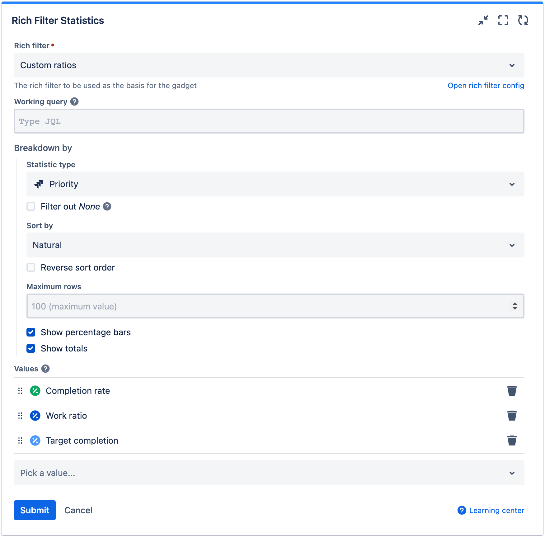
- Click Submit. Your Rich Filter Statistics gadget should look like this:

Now let's look at a two-dimensional breakdown example — here you'll create a statistics table that breaks down Work ratio by both Project and Priority.
- Add a Rich Filter Two Dimensional Statistics gadget to your dashboard.
- Move the gadget to the bottom of the right-hand column by dragging and dropping it.
- Configure the following fields in the gadget config form:
- Rich filter: Set this to the same rich filter as your other gadgets.
- Working query: In this example we want you to display this metric for a subset of available projects only; to filter for these you'll use a working query (see Customize issue views and gadget scope for more information). Enter JQL similar to "
project in ("Fox Service Desk", "Raven Service Desk", "Seal Service Desk")". In our case we chose service desk projects, but you can choose different projects as appropriate for your data. - Horizontal breakdown > Statistic type: Choose Project.
- Vertical breakdown > Statistic type: Choose Priority.
- Value: Select your Work ratio custom ratio.

- Click Submit. Your Rich Filter Two Dimensional Statistics gadget should look like this:

Custom ratios in time series
Finally for this article, we wanted to show you that it is possible to use custom ratios in time series (see Display date/time statistics and charts on your dashboard for more information about time series). This is a particularly useful combination that allows you to see how a ratio evolves over time.
Let's demonstrate with an example. You are going to create three different time series, then display them in a Rich Filter Time Series Chart gadget:
- Work ratio: This uses the Work ratio custom ratio as the base value, which shows how the time spent completing work matches up to the original estimates for that work. The time series is based on Resolved, so it is showing the work ratio of resolved issues over several aggregation periods. Ideally, the work ratio should stay near 100%, otherwise there is a problem with your estimations or your process is inefficient in some way.
- Top priority ratio: This uses the Top priority ratio custom ratio as the base value, which shows the ratio of issues that are highest and high priority. The time series is based on Created, so it is showing the top priority ratio of created issues over several aggregation periods. Ideally, this should stay consistent and at an acceptable level, otherwise there is something wrong with your prioritization.
- Due completion rate: This uses the Completion rate custom ratio as the base value, which shows the ratio of completed story points. The time series is based on Due date, so it is showing the rate of issues that were due in each aggregation period that are completed. Ideally, this should stay at 100%, otherwise some work was not completed by its due date and is overdue.
Let's begin by creating the required time series:
- Go back to your rich filter config, and open the Time series tab.
- Create the following time series:
- Work ratio:
- Name: "Work ratio"; give it a mid-blue color.
- Series: Choose Resolved.
- Base value: Select your Work ratio custom ratio.
- JQL: Leave blank.
- Top priority ratio:
- Name: "Top priority ratio"; color it orange.
- Series: Choose Created.
- Base value: Select your Top priority ratio custom ratio.
- JQL: Leave blank.
- Due completion rate:
- Name: "Due completion rate"; color it pink.
- Series: Choose Due date.
- Base value: Select your Completion rate custom ratio.
- JQL: Leave blank.
- Work ratio:
- Your Time series tab should look like the following. Check that it is correct before moving on.

Now let's display them in a time series chart:
- Go back to your dashboard and add a Rich Filter Time Series Chart gadget to it.
- Move the gadget to the bottom of the right-hand column by dragging and dropping it.
- Configure the following fields in the gadget config form:
- Rich filter: Set this to the same rich filter as your other gadgets.
- Aggregation periods: Select Weeks.
- Time range: Select Number of weeks.
- Number: Enter 12.
- Direction: Select Past.
- Aggregation type: Choose Cumulative total. This ensures that the ratio shown for each aggregation period is the average for that period and all that came before it, not only the individual period.
- Time series: Add your Work ratio, Due completion rate, and Top priority ratio time series to the list using the Pick a time series... dropdown.

- Click Submit. Your Rich Filter Time Series Chart gadget should look like this:

In general, these trends are looking healthy, with the exception of Due completion rate — this is starting to trend downward, indicating that some issues were not completed on time and are overdue.
Further exercises
To complete this tutorial, we'd like you to create some quick filters to provide additional interactive filtering of the issues shown in your gadgets. Your controller will already display the Teams smart filter you created earlier. Now you should:
- Add some static filters as described in Get started with Rich Filters for Jira Dashboards.
- Add some dynamic filters as described in Enhance your Jira dashboards with dynamic filters.
Remember that applying a quick filter in your controller will filter all gadgets based on the same rich filter as the controller. For example, the below image shows part of a Jira dashboard with three rich filter gadgets all being filtered by active quick filters in the controller. The dashboard is being filtered by Assignee and Priority.
