This page relates to the Cloud version of Rich Filters for Jira Dashboards. Please see the documentation index for Server & Data Center versions.
Create service management reports with rich filter charts & statistics
If you are involved in a company service management function, you will know that reporting is critical for your team's success. Your leadership will want regular reports to show that you are meeting company objectives with respect to SLAs and customer satisfaction levels. They will want this information in an easily-digestible format, allowing them to break the data down by different teams or service desks and look at trends over time. They want to see where the successes are, but also easily find problematic trends that allow preemptive responses to potential failures.
This article shows you how to create a powerful support request reporting dashboard with Rich Filters for Jira Dashboards that fulfills the needs described above, allowing you to report progress against targets, and monitor your work for success and problem patterns. This is a key part of delivering an effective ITSM strategy.
Prerequisites
This article assumes that you are using Jira Service Management.
Use case
Imagine the following scenario (your exact situation might have different numbers of projects or teams, or other constraints, but the principles are the same):
- You have three different service management projects to support three different products.
- To answer support requests, you have support agents grouped into two teams that provide coverage for different geographical regions.
- The support agents in each team have specialized knowledge of different products, with the aim of providing good overall coverage across all of them.
- You want to create an efficient way of reporting on Time to first response / Time to resolution SLAs and customer satisfaction, that can show trends over time and progress across multiple projects by team, customer, customer request type, individual assignee, etc.
How can you provide this level of reporting in an easy-to-digest format, all in one place?
Solution: Use a rich filter-powered dashboard for support request reporting
Rich Filters for Jira Dashboards provides a perfect feature set for reporting on your support request progress, which you'll see in action through the article. Rich filters are based on a standard Jira filter, hence the issues listed in rich filter gadgets can be cross-project. This enables you to build a single dashboard to report on multiple service management projects, giving rich filters a definite advantage over Jira's built-in Service Management reporting, which is defined for single projects.
To provide a solution to satisfy the use case detailed above, we are going to show you how to create the following dashboard:
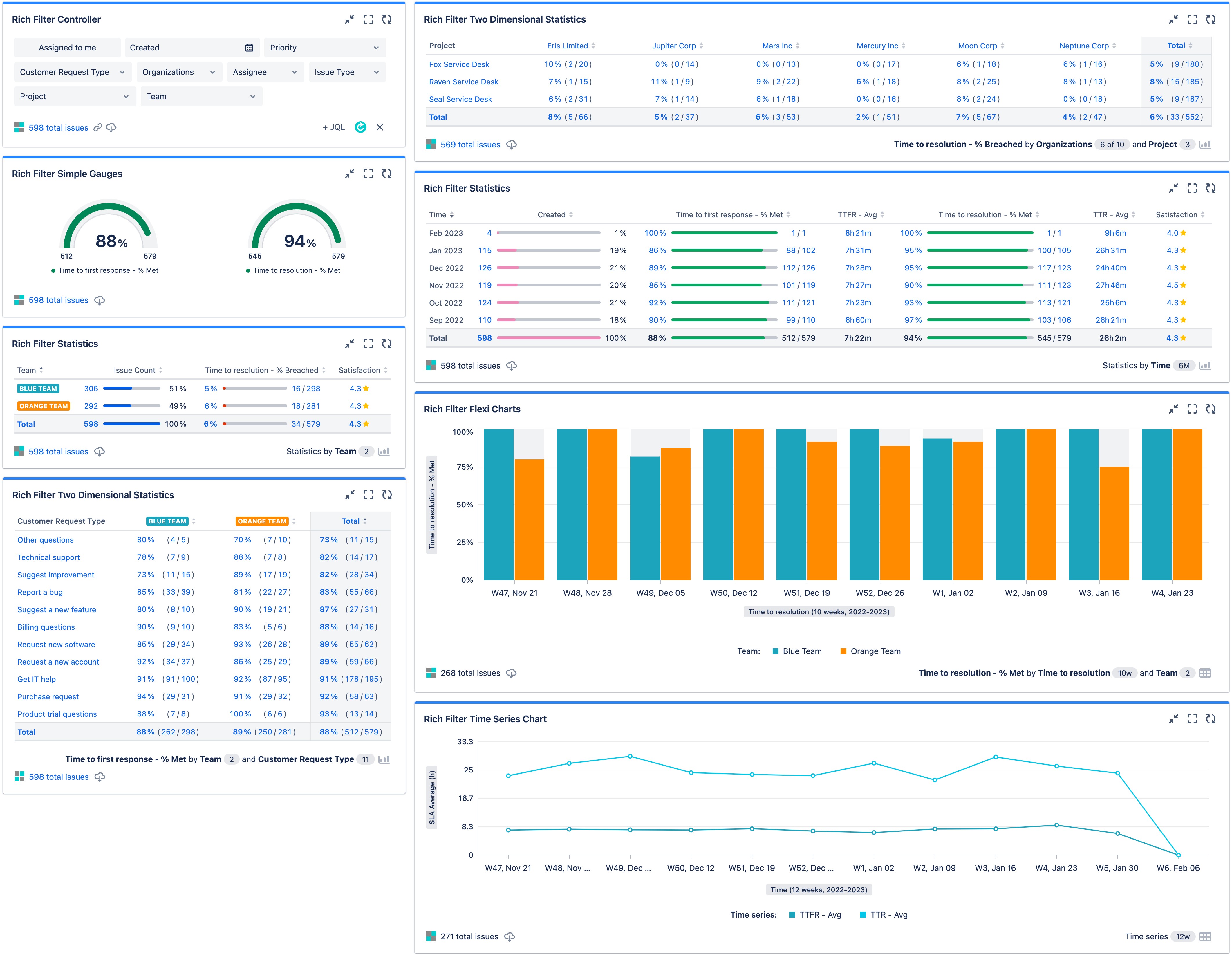
First of all, however, we'll explore how this dashboard works and how it can facilitate effective, powerful reporting across all your projects, customers, and teams. Later on, we'll walk you through how to build it.
At-a-glance reporting on overall SLA targets
On the left-hand side of the dashboard, we've got a set of gauges that provides a top-level view of where we are in terms of meeting our SLAs. Here we are showing % of met for both time to first response (TTFR) and time to resolution (TTR) SLAs:

This is a good place to talk about the quick filters inside the Rich Filter Controller. We can use these controls to filter the data shown in all the other rich filter gadgets, meaning that we can dynamically create more specific data breakdowns whenever needed. For example, we can filter by Blue Team and Fox Service Desk:
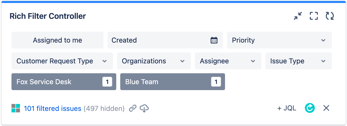
Our gauges will now show % of met for our SLAs, only for Blue Team working on the Fox Service Desk project:

Break down SLA targets by team and project
If you want some permanent views of specific data breakdowns that you find important, you can create these using rich filter statistics gadgets. In our reporting dashboard we've got three main breakdowns.
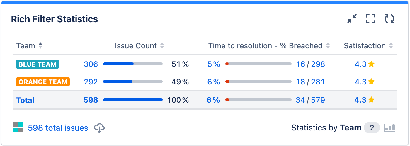
First of all, we show issue count, TTR % breached, and customer satisfaction for each of our teams:
We can also show a two-dimensional breakdown — in the next statistic gadget, we show TTFR % met for each combination of team and customer request type, so we can see how each team is performing on each type of request, and see where potential weaknesses are. The customer request types are ordered ascending from lowest performance to highest.

Finally, we show a two-dimensional breakdown of TTR % breached for each combination of organization and service management project.

You can create breakdowns of data based on whatever statistics you wish, and you can also filter any of them using the quick filters in your controller.
Generating quick charts
You can dynamically create a quick chart to summarize the data in any statistics gadget by clicking the Switch to quick chart view button in the bottom-right-hand-corner:
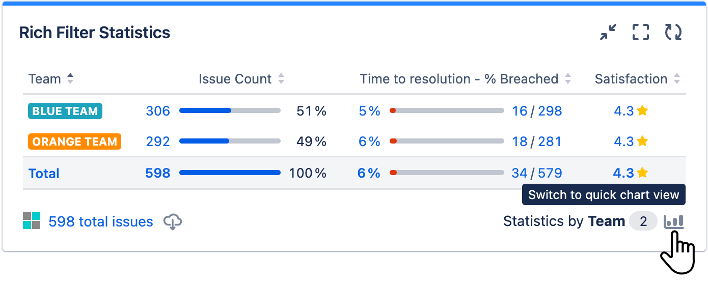
Clicking the button displays a chart that summarizes the data in the statistics table. For example:

Note that chart gadgets (e.g. Rich Filter Flexi Charts, Rich Filter Time Series Chart) have a Show table button in the bottom-right-hand corner that allow you to generate quick tables from charts.
Show historical progress against targets
Our last category of gadgets in this dashboard provides breakdowns and views of historical data from various time series — a powerful way to check on trends and progress.
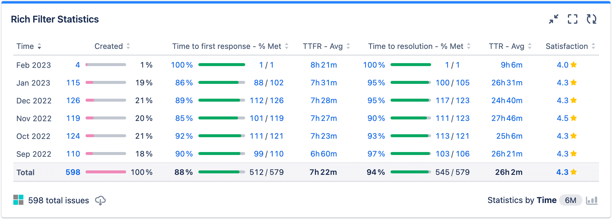
First of all, we've got another statistics gadget showing columns for a number of useful statistic types — number of created issues, TTFR % met, TTFR average, TTR % met, TTR average, and customer satisfaction. In each row, we show historic monthly totals for each statistic type, with the most recent month at the top.
We can also provide charts to summarize our data. In a flexi chart gadget, we show TTR % met by team and TTR over historic weeks.

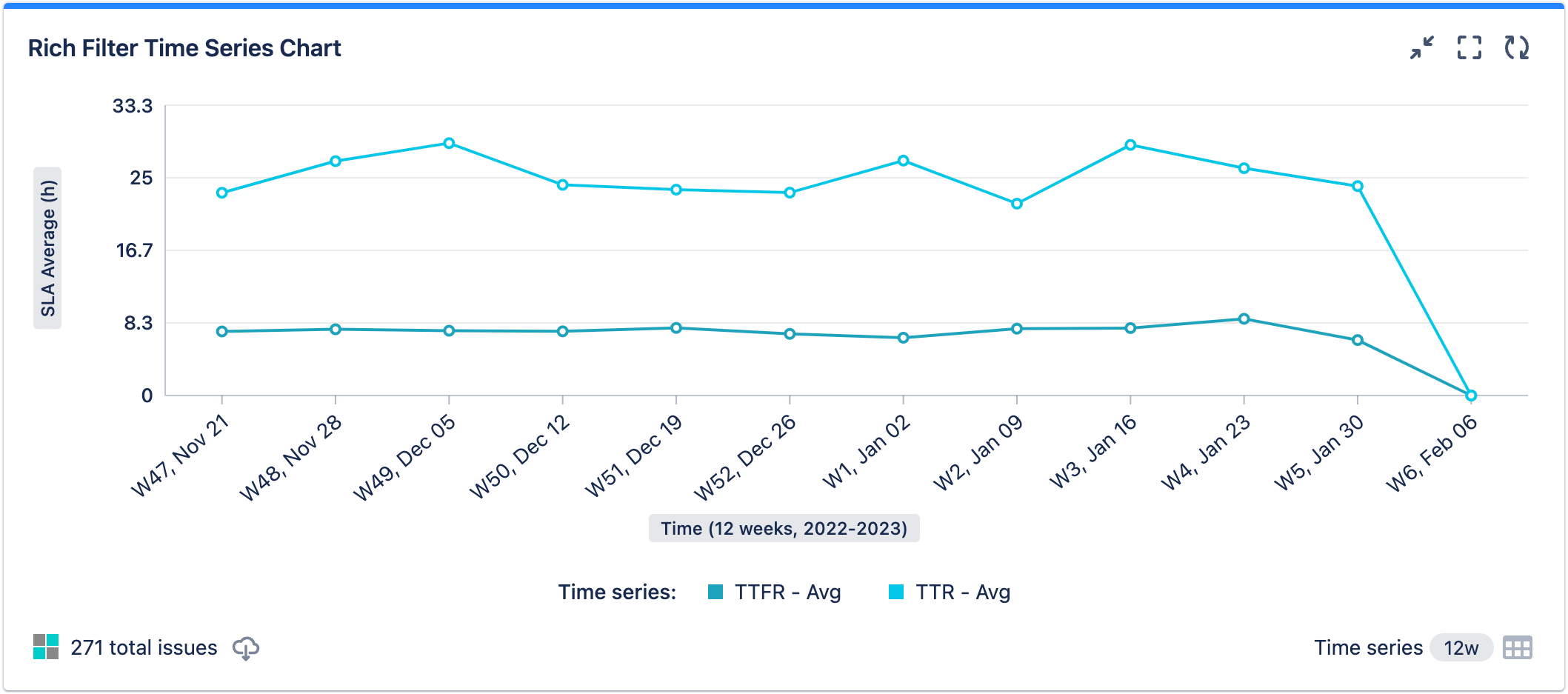
Finally, we use a dedicated time series chart to show the historic weekly trends for TTFR average and TTR average in hours.
Rich filter features resources
The following links provide information on the fundamentals of each rich filter feature used in this dashboard, in case you need more information:
- Rich Filter Simple Gauges to provide at-a-glance summaries of your SLA targets.
- Rich Filter Statistics gadgets to provide one- and two-dimensional breakdowns based on configurable statistic types, including date ranges.
- Rich Filter Flexi Charts gadgets to effectively summarize your data and show trends in a visual format.
- Rich Filter Time Series, which allow you to precisely define custom time series (such as SLA averages) based on existing date fields, and a Rich Filter Time Series Chart gadget to efficiently display them.
- A Rich Filter Controller gadget containing static, dynamic, and smart filters, which enable you to filter your reporting gadgets by different dimensions.
Start building the Support request reporting dashboard
Now that we've explained what our solution can do, let's go ahead and build it.
In this section, you'll create a new rich filter and a dashboard with minimal configuration to begin with. If you need any instruction on creating rich filters and dashboard basics, you can find it in Get started with Rich Filters for Jira Dashboards.
- Create a new rich filter based on a Jira filter that returns all the support request issues you want to report on with your dashboard (see Get started with Rich Filters for Jira Dashboards for guidance if needed). Call it something appropriate like "Support request reporting". Remember that your Jira filter can return support request issues from multiple Service Management projects, therefore this solution has the advantage that it is cross-project.
- Create a new dashboard with the Left sidebar layout, called something appropriate like "Support request reporting dashboard".
- Add a Rich Filter Controller gadget to your dashboard.
- Select your Support request reporting rich filter as the Rich filter value, then click Submit:
- Press the Done button at the top of the UI to exit dashboard edit mode.
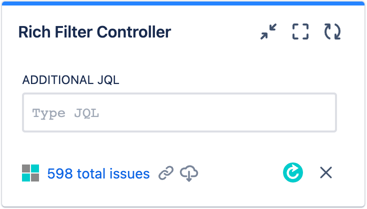
You should now have a basic dashboard that contains a single Rich Filter Controller gadget:
Important time-saving tips:
- When you need to further configure an existing gadget, don't do it via dashboard edit mode — you can do it more quickly and with fewer dashboard refreshes using the Rich filter menu available on each rich filter gadget.
- The Rich filter menu also contains an option to open the config for the rich filter the gadget is based on. For convenience, we recommend that you keep the dashboard open in one browser tab, the rich filter config open in another tab, and move between the two as required.
- When you've made a change to the rich filter config in one tab and want to see those changes reflected in the dashboard in the other tab, refresh your dashboard quickly and conveniently using your controller's Optimized refresh button.
Set up your filters
In this section, you will create all the quick filters you'll use in your dashboard. The static and dynamic filters will be usable from your controller and provide a lot of power — they filter the content shown in all other rich filter gadgets based on the same rich filter as the controller (for more information on static and dynamic filters, have a look at Get started with Rich Filters for Jira Dashboards and Enhance your Jira dashboards with dynamic filters).
- Go to the Static Filters tab of your rich filter config (accessed via the Rich filter menu) and create a new static filter called "Assigned to me", with the JQL "
assignee = currentUser()". Go to the Dynamic Filters tab and add dynamic filters based on the following Jira fields — Created, Priority, Customer Request Type, Organizations, Assignee, Issue Type, and Project.
In our scenario, we have two support teams. Let's create a "Team" smart filter to allow you to display a quick filter in your controller to filter by team (for more information on configuring and using smart filters, see our Use custom smart filters and smart columns on your dashboard article).
- Go to the Smart Filters tab.
- Create a new smart filter called "Team".
- In the Team config screen, create a separate smart clause for each team. We've included two, but you might want to include more:
- "Blue Team": Give it a blue color and JQL to filter by members of that team, for example "
assignee in membersOf("blue-team")". - "Orange Team": Give it an orange color and JQL to filter by members of that team, for example "
assignee in membersOf("orange-team")"
- "Blue Team": Give it a blue color and JQL to filter by members of that team, for example "
As an alternative to the above JQL, you might instead want to filter each team's JIRA issues using JQL like "assignee in (a,b,c)", where the letters are different assignee IDs.
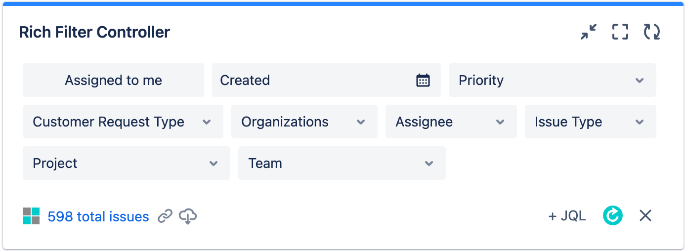
Go back to your dashboard and refresh it; your controller should look like this:
Set up your time series
In this section, you'll create some custom time series that you can then use in your gadgets to easily display trends over time as desired (see Configuring Time Series for more information).
- Go to the Time Series tab of your rich filter config.
- Create a new time series called "Created", with a custom pink color.
- Choose the Created field as the Series to show.
- Choose Issue Count for the Base value. This means that this series will provide an issue count for created issues over time.
- Click Create.
Repeat the process to create five more time series; choose a custom color for each one:
- "Satisfaction": Show customer satisfaction for resolved issues over time.
- Color: yellow.
- Series: Resolved.
- Base value: Satisfaction.
- "TTFR - Avg": Show average TTFR over time.
- Color: mid blue.
- Series: Time to first response (completion date).
- Base value: Time to first response - Average.
- "TTR - Avg": Show average TTR over time.
- Color: sky blue.
- Series: Time to resolution (completion date).
- Base value: Time to resolution - Average.
- "Time to first response - % Met": Show TTFR met/total over time.
- Color: green.
- Series: Time to first response (completion date).
- Base value: Time to first response - % Met.
- "Time to resolution - % Met": Show TTR met/total over time.
- Color: green.
- Series: Time to resolution (completion date).
- Base value: Time to resolution - % Met.
Your Time Series tab should now look like this:

Set up the Rich Filter Simple Gauges gadget
Let's get your dashboard set up! You'll start by adding the Rich Filter Simple Gauges gadget (for more information on gauges, see our Use rich filter counters and gauges in your dashboards article).
- Go to dashboard edit mode and add a Rich Filter Simple Gauges gadget to your dashboard.
- Position it below your controller in the left-hand column.
- In the gadget config form, start by selecting your Support request reporting rich filter in the Rich filter dropdown.
- Add the following SLA ratios to the Gauge filters and values list by choosing them from the Pick a filter... dropdown.
- Time to first response - % Met
- Time to resolution - % Met
- Time to first response - % Met
- Click Submit.
Your Rich Filter Simple Gauges gadget will now look like this:
Set up the first Rich Filter Statistics gadget
Next, you'll add a Rich Filter Statistics gadget, which provides a simple breakdown of issue count, TTR % breached, and customer satisfaction, by team (for further information on one- and two-dimensional statistics, see Display statistics and quick charts on your dashboard).
- Go to dashboard edit mode and add a Rich Filter Statistics gadget to your dashboard.
- Position it below your Rich Filter Simple Gauges gadget in the left-hand column.
- In the gadget config form, start by selecting your Support request reporting rich filter in the Rich filter dropdown.
- In Breakdown by > Statistic type, select your Team smart filter.
- Choose the following Values in the Pick a value... dropdown:
- Issue Count
- Time to resolution - % Breached
- Satisfaction
- Click Submit.
Your left-hand Rich Filter Statistics gadget should look like this:
Set up the first Rich Filter Two Dimensional Statistics gadget
Now you'll add a Rich Filter Two Dimensional Statistics gadget, which will provide a breakdown of TTFR (met) by team and customer request type.
- Go to dashboard edit mode and add a Rich Filter Two Dimensional Statistics gadget to your dashboard.
- Position it below your Rich Filter Statistics gadget in the left-hand column.
- In the gadget config form, start by selecting your Support request reporting rich filter in the Rich filter dropdown.
- In Horizontal breakdown > Statistic type, select your Team smart filter.
- In Vertical breakdown > Statistic type, select Customer Request Type.
- In Vertical breakdown > Sort by, select Total.
- Check the Vertical breakdown > Reverse sort order checkbox, so that you see the customer request types with the worst performance (lowest totals) at the top of the list.
- In the Value dropdown, select Time to first response - % Met.
- Click Submit.
Your left-hand Rich Filter Two Dimensional Statistics gadget should look like this:
Set up the second Rich Filter Two Dimensional Statistics gadget
To show a useful bit of variety in reporting, you will now add another Rich Filter Two Dimensional Statistics gadget. This will provide a breakdown of TTR % breached by organization and project.
- Go to dashboard edit mode and add another Rich Filter Two Dimensional Statistics gadget to your dashboard.
- Position it at the top of the right-hand column.
- In the gadget config form, start by selecting your Support request reporting rich filter in the Rich filter dropdown.
- In Horizontal breakdown > Statistic type, select Organizations.
- Check the Horizontal breakdown > Filter out None checkbox — in this case, it is not useful to see information on issues that are not relevant to any organization.
- In Vertical breakdown > Statistic type, select Project.
- In the Value dropdown, select Time to resolution - % Breached.
- Click Submit.
Your right-hand Rich Filter Two Dimensional Statistics gadget should look like this:
Set up the second Rich Filter Statistics gadget
Your next gadget will be another Rich Filter Statistics gadget. With this, you'll start to see how powerful rich filters can be for showing trends over time: let's play with some time series. This gadget will provide a breakdown over time of created issues, TTFR % met, average TTFR, TTR % met, average TTR, and customer satisfaction — all by month.
- Go to dashboard edit mode and add another Rich Filter Statistics gadget to your dashboard.
- Position it in the right-hand column, below the Rich Filter Two Dimensional Statistics gadget.
- In the gadget config form, start by selecting your Support request reporting rich filter in the Rich filter dropdown.
- In Breakdown by > Statistic type, select Time series. This means that you'll be choosing time series to display trends over time in this gadget.
- For Aggregation periods, select Months — we want to show a data breakdown by each separate month.
- In the fields below, select Time range: Number of months, Number: 6, Direction: Past. We want to show totals for each of the last 6 months.
- Check the Reverse sort order checkbox, so that you see the most recent month at the top of the list.
- Choose the following Time series in the Pick a time series... dropdown:
- Created
- Time to first response - % Met
- TTFR - Avg
- Time to resolution - % Met
- TTR - Avg
- Satisfaction
- Click Submit.
Your right-hand Rich Filter Statistics gadget should look like this:
Set up the Rich Filter Flexi Charts gadget
Now you'll add a Rich Filter Flexi Charts gadget; you'll use this to create a clustered bar graph showing the percentage of issues that had the TTR met over a historical series of weeks for each team. If you need more guidance on setting up flexi charts, have a look at Display custom charts and quick tables on your dashboard.
- Go to dashboard edit mode and add a Rich Filter Flexi Charts gadget to your dashboard.
- Position it in the right-hand column, below the Rich Filter Statistics gadget.
- In the gadget config form, start by selecting your Support request reporting rich filter in the Rich filter dropdown.
- For the Chart type, choose Clustered bar.
- In Primary Breakdown > Statistic type, select Time to resolution (completion date).
- For Aggregation periods, select Weeks.
- In the fields below, select Time range: Between dates, then select From and To dates that nicely encapsulate your data range.
- In Secondary Breakdown > Statistic type, select Team.
- For Value, select Time to resolution - % Met.
- Click Submit.
Your Rich Filter Flexi Charts gadget should look like this:
Set up the Rich Filter Time Series Chart gadget
Finally, you'll add a Rich Filter Time Series Chart gadget. This will show a handy line graph of the historical average TTFR and TTR trends (for more information on configuring time series gadgets, see The Rich Filter Time Series Chart Gadget).
- Go to dashboard edit mode and add a Rich Filter Time Series Charts gadget to your dashboard.
- Position it in the right-hand column, below the Rich Filter Flexi Charts gadget.
- In the gadget config form, start by selecting your Support request reporting rich filter in the Rich filter dropdown.
- For Aggregation periods, select Weeks.
- In the fields below, select Time range: Number of weeks, Number: 12, Direction: Past.
- For Time series, select TTFR - Avg and TTR - Avg.
- Click Submit.
Your Rich Filter Time Series Chart gadget should look like this:
Time series gadgets allow you to report on multiple date fields in the same chart, as seen in this example.
Final result